The range grew faster than the brand.
Every new product was designed from scratch. Labels disagreed on color, type, and logo placement; as retailers multiplied, the shelf presence fragmented. Ethmar didn't need another logo — it needed an identity that behaves like infrastructure, so the range could keep growing without redesign.
A friendly, trusted, bilingual food brand — warm where competitors were clinical. The strategy set the palette, the tone, and what the mark had to say before anything was drawn.
One layout grid, color-coded product ranges, and bilingual type rules — so a tuna can and a juice carton are unmistakably the same brand, and every new SKU slots in.
The rulebook Ethmar's team actually uses, and print production in-house — artwork to shelf with no handoff and no drift.
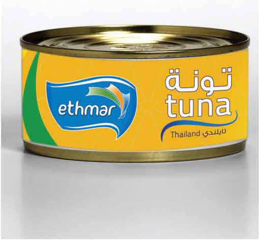


A range that grows without a redesign — every product unmistakably Ethmar at shelf distance.
Color-coded ranges on one grid — the brand reads before the product name does.
A new package is a template decision, not a design project — days instead of weeks.
In-house production means what was approved is what ships — no drift between artwork and shelf.