Trust you can put on paper — and on a floor.
An investment firm lives on credibility. Maceen Capital needed an identity that reads institutional to investors, carries Arabic heritage without pastiche, and survives its two hardest tests: a dense annual report and a crowded expo floor.
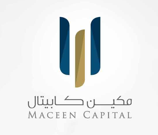
Intersecting translucent letterforms — solidity where they overlap — in navy and gold, with a bilingual wordmark set Arabic-first.
Annual reports, sales kits, and office collateral designed in the system and produced in-house — documents that hold institutional scrutiny.
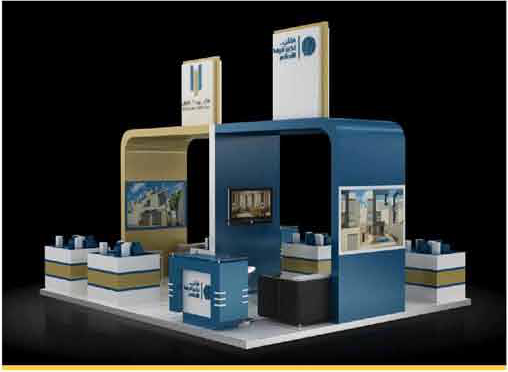
The identity translated to an investor-expo booth — navy and gold volumes, modeled in 3D and approved before build.
One identity from page to booth — institutional on paper, unmistakable on the floor.
Navy, gold, and disciplined type — heritage carried without pastiche, credibility without noise.
Annual reports and sales kits investors take seriously — designed and produced by one team.
The booth is the brand at walking distance — same forms, same palette, no translation loss.