Two languages, one door, three seconds.
A restaurant is judged from a moving car. Leil Nhar's bilingual mark had to read Arabic-first, translate cleanly for everyone else, and survive fabrication — because most people only ever meet it as a sign above a door.
The mark translated into buildable drawings — dimensional letters, sun-and-moon tile panels, and materials specced to match the artwork exactly.
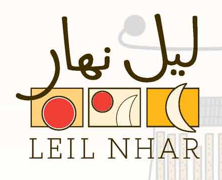
Arabic leads, LEIL NHAR in wide latin capitals beneath — sized, spaced, and lit to read from across the street.
Production and printing on our own floor, then installation on site — one team from file to fascia, no fabricator handoff.
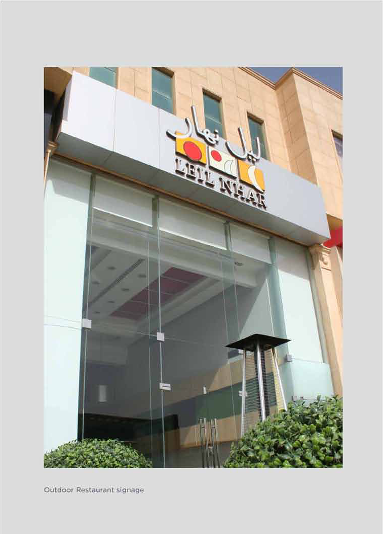
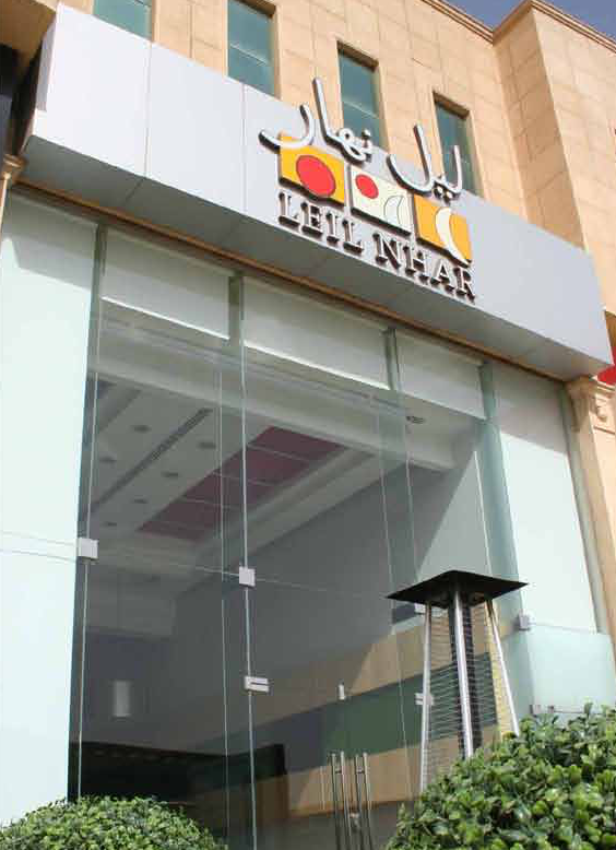
The storefront is the advertisement — the identity works hardest exactly where it's met.
Arabic first, latin beneath — both audiences get the name in a glance.
What was drawn is what was built — dimensional letters and tiles that match the artwork.
Local and hand-made in feel, disciplined in system — hospitality that doesn't look templated.