Bold output, invisible brand.
Jaroudi Media produced daring work for clients while wearing a generic mark itself. To win agencies and advertisers, the production house needed an identity with the nerve of its showreel — personal, confident, and impossible to mistake for a corporate template.
The logotype is drawn as a signature — a producer signing their work. Dynamic, personal, and daring, it projects the personality the house already had.
Press ads art-directed in-house — "Expectation and Beyond" — with the signature as the sign-off on every placement.
A monochrome-with-red art direction for campaign imagery — cinematic, editorial, and consistent across every ad.
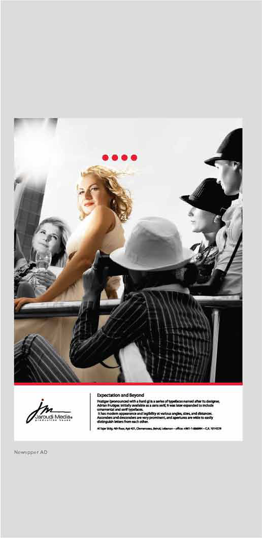
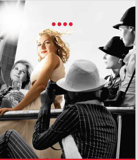
A brand that finally matches the reel — one voice from logotype to full-page ad.
The mark signs every frame, ad, and slate the house puts out — ownership made visible.
Design, copy, and photography were built together, so the press work sounds like the brand looks.
The scripted mark holds from a newspaper page to a title card without losing its nerve.